
Feature Design
Feature Design
Feature Design
Secured Health
Secured Health
Secured Health
Bridging connections between individuals and culturally and linguistically competent community health workers, doulas, and social workers who close care gaps and improve lives.
Bridging connections between individuals and culturally and linguistically competent community health workers, doulas, and social workers.
Bridging connections between individuals and culturally and linguistically competent community health workers, doulas, and social workers who close care gaps and improve lives.

Feature Design
Secured Health
Bridging connections between individuals and culturally and linguistically competent community health workers, doulas, and social workers who close care gaps and improve lives.
Overview
Overview
Overview
My Role
Product Designer
Team
Michael Evans (PL)
Joseph Cabellero (SWE)
Timeline
July - Dec. 2025
Process
UI Design
Prototyping
Client Feedback
Redesign
Design Systems
Tools
Figma
Asana
My Role
Product Designer
Team
Michael Evans (PL)
Joseph Cabellero (SWE)
Timeline
July - Dec. 2025
Process
UI Design
Prototyping
Client Feedback
Redesign
Design Systems
Tools
Figma
Asana
My Role
Product Designer
Team
Michael Evans (PL)
Joseph Cabellero (SWE)
Timeline
July - Dec. 2025
Process
UI Design
Prototyping
Client Feedback
Redesign
Design Systems
Tools
Figma
Asana
What's Secured Health?
What's Secured Health?
Founded in 2023, Secured Health is an engagement platform enabling community-based organizations to act as care navigators for their members in their health & social needs journeys. Currently, they are in pre-seed funding with multiple healthcare partnerships and ACO (Accountable Care Organization) integrations established.
Founded in 2023, Secured Health is an engagement platform enabling community-based organizations to act as care navigators for their members in their health & social needs journeys. Currently, they are in pre-seed funding with multiple healthcare partnerships and ACO (Accountable Care Organization) integrations established.
6
active contracts across Maryland, Virginia, Pennsylvania, Georgia, Illinois, and Washington D.C.
active contracts across Maryland, Virginia, Pennsylvania, Georgia, Illinois, and Washington D.C.
active contracts across Maryland, Virginia, Pennsylvania, Georgia, Illinois, and Washington D.C.
75%
engagement
engagement
across 19k+ patients
across 19k+ patients
across 19k+ patients
15 appointments scheduled per day (KPI target)
15 appointments scheduled per day (KPI target)
15 appointments scheduled per day (KPI target)
6
active contracts across Maryland, Virginia, Pennsylvania, Georgia, Illinois, and Washington D.C.
75% engagement
across 19k+ patients
15 appointments scheduled per day (KPI target)
Scope of the Role
Scope of the Role
Prior to my co-op, the MVP has been released, with an extensive design system established by a previous designer. My role as Product Designer was to lead design development of new features and flows, as well as update existing designs and components to match the current product.
Prior to my co-op, the MVP has been released, with an extensive design system established by a previous designer. My role as Product Designer was to lead design development of new features and flows, as well as update existing designs and components to match the current product.
Notable New Features
Notable New Features
Notable New Features
01 | Auto-fill Medicaid Renewal
01 | Auto-fill Medicaid Renewal
Context
Context
As part of a new release, we wanted to expand into medicaid renewal as a new job type for community health workers (CHWs). With this feature, CHWs could assist members in renewing medicaid for their respective state.
As part of a new release, we wanted to expand into medicaid renewal as a new job type for community health workers (CHWs). With this feature, CHWs could assist members in renewing medicaid for their respective state.
Problem
Problem
Completing renewal forms took an average of 45 minutes, causing unnecessary delays that decrease job efficiency.
Completing renewal forms took an average of 45 minutes, causing unnecessary delays that decrease job efficiency.
What do other products do?
What do other products do?
I began by looking at other products that tackled a similar problem, such as Docusign, Adobe Acrobat, and namely, Turbotax. A common theme was some form of file upload to extract information from - other options like a reusable profile or drag-and-drop UI would require extensive manual interaction to begin with.
I began by looking at other products that tackled a similar problem, such as Docusign, Adobe Acrobat, and namely, Turbotax. A common theme was some form of file upload to extract information from - other options like a reusable profile or drag-and-drop UI would require extensive manual interaction to begin with.


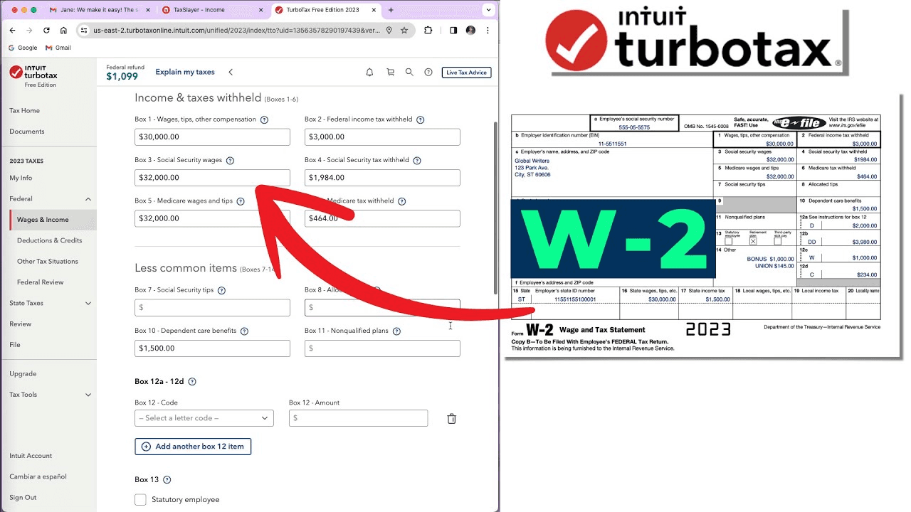
Reiterated by my manager, the primary goal of this feature is to reduce the average time of form completion as much as we can - leading me to dive deeper into media uploads to power auto-filled capabilities.
Reiterated by my manager, the primary goal of this feature is to reduce the average time of form completion as much as we can - leading me to dive deeper into media uploads to power auto-filled capabilities.
Solution
Solution
AI autofill through media uploads, only requiring CHW confirmation before submission.
AI autofill through media uploads, only requiring CHW confirmation before submission.
High-fidelity Iterations
High-fidelity Iterations
I started with initial layouts for the media upload stage, using empty states, modals, and file dashboards. However, a major drawback I noticed was the lack of screen space to use, leading me to eliminate both the sidebar and progress bar.
I started with initial layouts for the media upload stage, using empty states, modals, and file dashboards. However, a major drawback I noticed was the lack of screen space to use, leading me to eliminate both the sidebar and progress bar.


In a meeting with my manager, he brought up the concern of CHWs having full access to a members private information when uploading files. So, a small phrasing change from "Upload a file" to "Take a photo" to enforce instant photo capture and eliminate that safety issue.
In a meeting with my manager, he brought up the concern of CHWs having full access to a members private information when uploading files. So, a small phrasing change from "Upload a file" to "Take a photo" to enforce instant photo capture and eliminate that safety issue.
Moving onto the form screen, I began with a split-screen view of both the editable fields of information and the form itself. This layout made sense, but would require additional work for developers to manage each form's unique fields and would still require tedious, visual tracking of fields across both views for CHWs.
Moving onto the form screen, I began with a split-screen view of both the editable fields of information and the form itself. This layout made sense, but would require additional work for developers to manage each form's unique fields and would still require tedious, visual tracking of fields across both views for CHWs.

This also freed up space to accommodate the member's profile information and uploaded media, giving CHWs the ability to upload at this stage as well.
Taking inspiration from code editing confirmations in Cursor, I pivoted towards the concept of tags attached to each field with specific borders and fills to denote status.
This also freed up space to accommodate the member's profile information and uploaded media, giving CHWs the ability to upload at this stage as well.
Taking inspiration from code editing confirmation in many IDE's, I played around with the concept of tags attached to each field, with specific borders and fills to denote status of field.
Taking inspiration from code editing confirmations in Cursor, I pivoted towards the concept of tags attached to each field with specific borders and fills to denote status.
This also freed up space to accommodate the member's profile information and uploaded media, giving CHWs the ability to upload at this stage as well.
Client Feedback
Client Feedback
With a base prototype established, a client meeting was held and they brought up thoughts on how to handle additional dependents. So, I brainstormed a few variations of layouts, button types, and text - ultimately landing on a clear question and CTA to direct CHWs.
With a general prototype established, a client meeting was held and they brought up thoughts on how to handle additional dependents. So I brainstormed a few variations of layouts, button types, and text - ultimately landing on a clear question and CTA to direct CHWs.
With a base prototype established, a client meeting was held and they brought up thoughts on how to handle additional dependents. So, I brainstormed a few variations of layouts, button types, and text - ultimately landing on a clear question and CTA to direct CHWs.
Approved Final Designs
Approved Final Designs


1
Split-screen view to manage uploads and form
Split-screen view to manage uploads and form
2
Simple CHW interaction to confirm or edit autofilled information
Simple CHW interaction to confirm or edit autofilled information
3
Status signifiers to guide process, aided by tooltip
Status signifiers to guide process, aided by tooltip
4
Complete confirmation enforced prior to submission
Complete confirmation enforced prior to submission
I also adapted the final designs for iOS, in both mobile and tablet breakpoints, to provide flexibility for CHWs when completing form renewals. A major challenge unique to mobile was figuring out how to use the smaller screen space efficiently, leading me to create a horizontal orientation as well.
I also adapted the final designs for iOS, in both mobile and tablet breakpoints, to provide flexibility for CHWs when completing form renewals. A major challenge unique to mobile was figuring out how to use the smaller screen space efficiently, leading me to create a horizontal orientation as well.
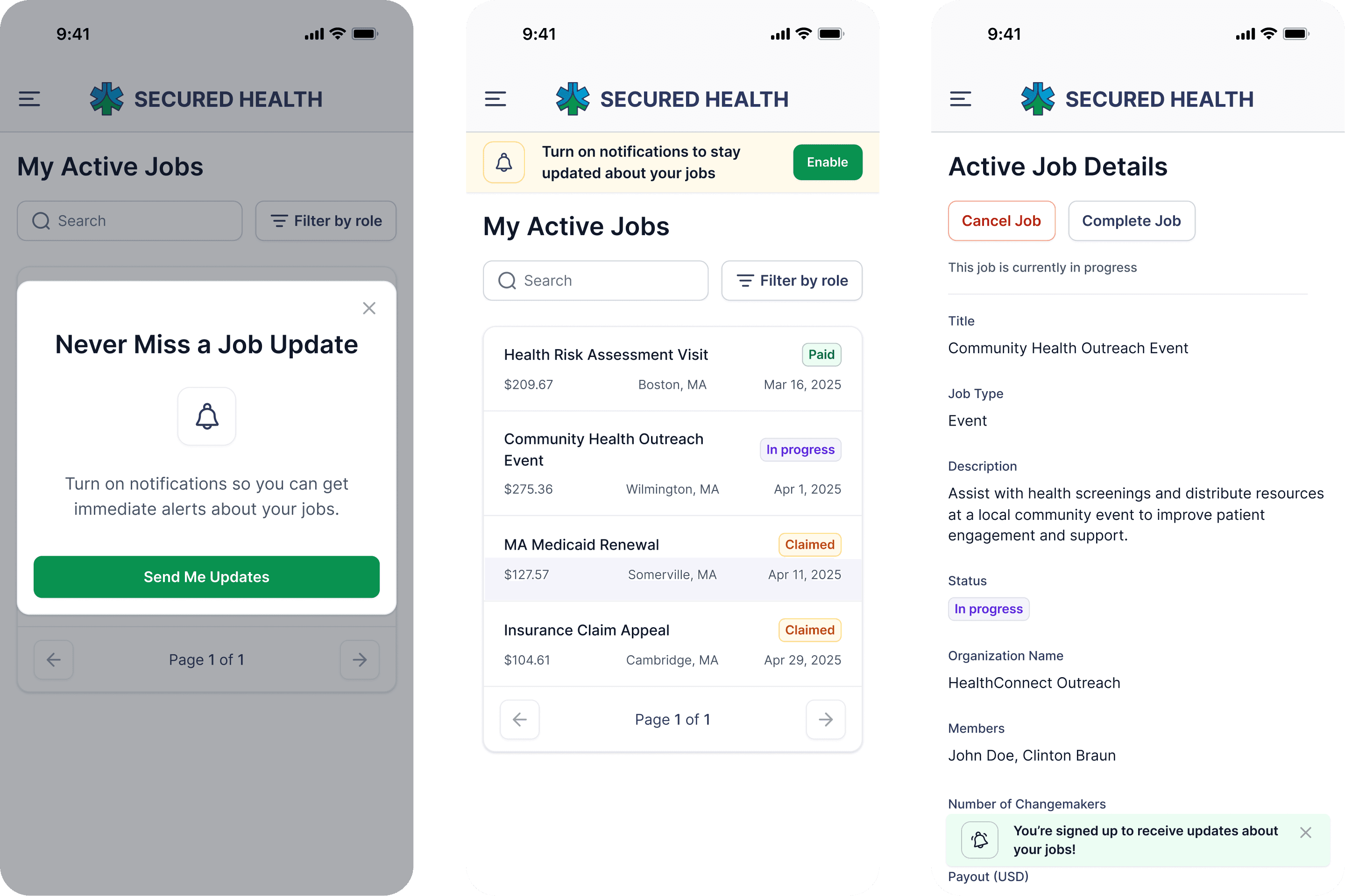
02 | 'Enable Notifications' Prompt & Reminders
02 | 'Enable Notifications' Prompt & Reminders
02 | 'Enable Notifications' Prompt & Reminders
Context
Context
With the web app fully released, the company was looking to establish the app with more features. Prior to my work, the app simply directed CHWs to the web platform for most main features.
With the web app fully released, the company was looking to establish the app with more features. Prior to my work, the app simply directed CHWs to the web platform for most main features.
Task
Task
Redesign 'Enable Notifications' screens to match current UI and engage CHWs
Integrate of notification settings alerts into the active jobs flow for iOS
Redesign 'Enable Notifications' screens to match current UI and engage CHWs
Integrate of notification settings alerts into the active jobs flow for iOS
Refreshing Initial Notification Opt-In
Refreshing Initial Notification Opt-In
Using the original design as reference for content, I explored different layouts, alignment, and logo usage. My manager preferred V6, but asked me to play around with color and text to really encourage the user to want take action.
Using the original design as reference for content, I explored different layouts, alignment, and logo usage. My manager preferred V4, but asked me to play around with color and text to really encourage the user to want take action.
Using the original design as reference for content, I explored different layouts, alignment, and logo usage. My manager preferred V6, but asked me to play around with color and text to really encourage the user to want take action.
With some team feedback, I settled on a final redesign - clear wording to present the benefits of enabling notifications. I also included a tablet breakpoint, making sure to cap content width to prioritize readability.
With some team feedback, I settled on a final redesign - clear wording to present the benefits of enabling notifications. I also included a tablet breakpoint, making sure to cap content width to prioritize readability.

Driving CHWs to Benefit from Notifications
Driving CHWs to Benefit from Notifications
With the rest of the 'Active Jobs' flow already established on the web app, I adapted those designs for iOS, adjusting visual hierarchy, padding, and sidebar as needed. At this point, I decided to modify the initial 'Enable Notifications' screens to modals, as I felt it would integrate better into the flow of app navigation for CHWs.
With the rest of the 'Active Jobs' flow already established on the web app, I adapted those designs for iOS, adjusting visual hierarchy, padding, and sidebar as needed. At this point, I decided to modify the initial 'Enable Notifications' screens to modals, as I felt it would integrate better into the flow of app navigation for CHWs.
With the rest of the 'Active Jobs' flow already established on the web app, I adapted those designs for iOS, adjusting visual hierarchy, padding, and sidebar as needed. At this point, I decided to modify the initial 'Enable Notifications' screens to modals, as I felt it would integrate better into the flow of app navigation for CHWs.

Aiming to get all CHWs signed up for notifications, I created 10+ variations of a static banner that would persist on screen until notifications were enabled. Eventually, I finalized one to move forward with, choosing a distinct yellow and clear CTA to prompt interaction.
Aiming to get all CHWs signed up for notifications, I created 10+ variations of a static banner that would persist on screen until notifications were enabled. Eventually, I finalized one to move forward with, choosing a distinct yellow and clear CTA to prompt interaction.
Aiming to get all CHWs signed up for notifications, I created 10+ variations of a static banner that would persist on screen until notifications were enabled. Eventually, I finalized one to move forward with, choosing a distinct yellow and clear CTA to prompt interaction.
Final Flow and Designs
Final Flow and Designs


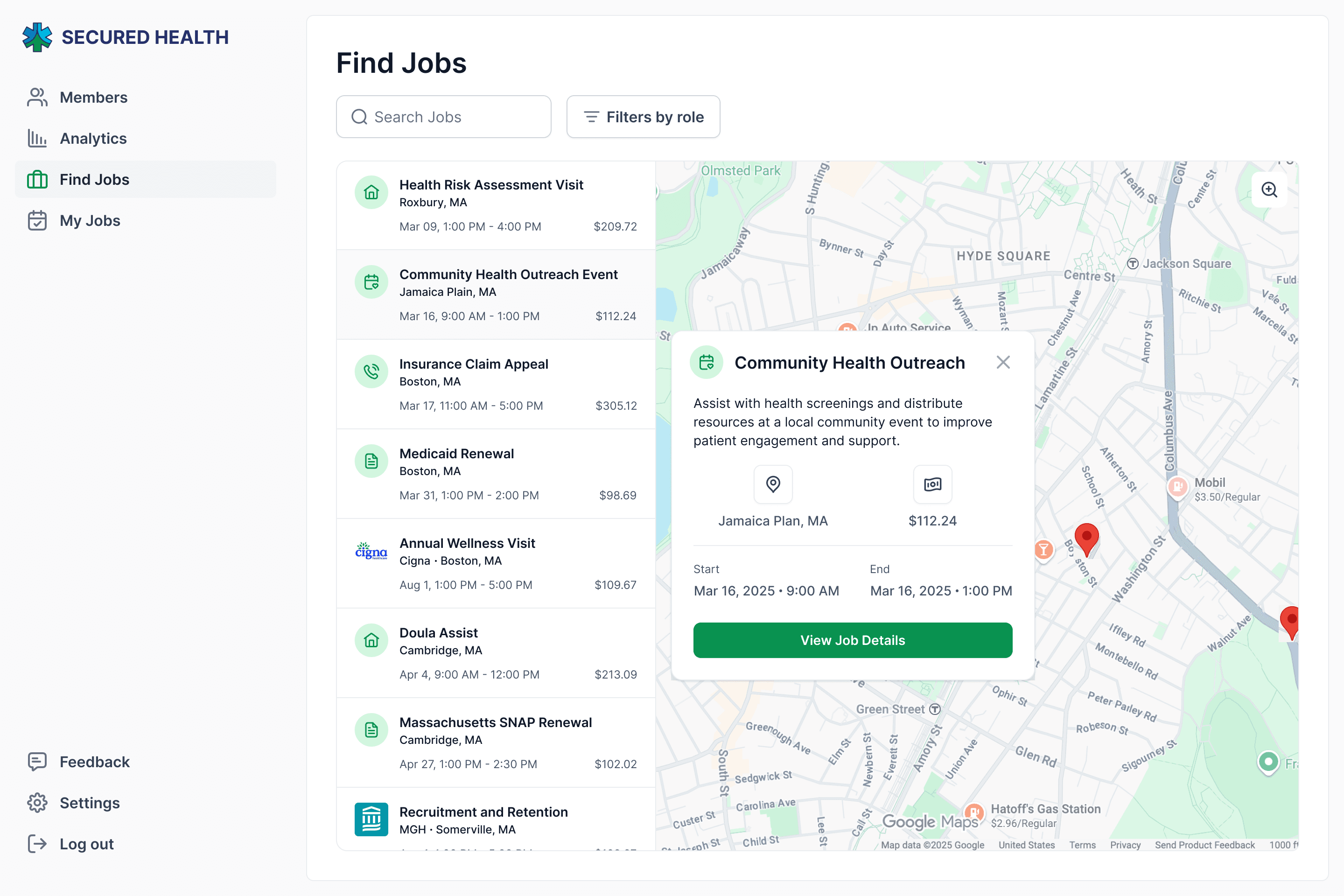
03 | Map View for Jobs Dashboard
03 | Map View for Jobs Dashboard
03 | Map View for Jobs Dashboard
Task
Task
Create a map view for CHWs to view available jobs in their area, with an option to view full job details
Create a map view for CHWs to view available jobs in their area, with an option to view full job details
Learning from Industry Leaders
Learning from Industry Leaders
For this feature, I mainly looked into Google Maps, looking how they laid out their list of locations and card design when viewing further details. With this reference, I sketched out a rough layout of the dashboard map view, planning general elements that would need to be included.
For this feature, I mainly looked into Google Maps, looking how they laid out their list of locations and card design when viewing further details. With this reference, I sketched out a rough layout of the dashboard map view, planning general elements that would need to be included.

Rapid Iterations
Rapid Iterations
Moving forward, I tried out some variations of both the jobs list and job card, focusing on different spacing, type hierarchy, level of information shown, and icon usage.
Moving forward, I tried out some variations of both the jobs list and job card, focusing on different spacing, type hierarchy, level of information shown, and icon usage.
Following some feedback from my manager, I included some designs with organization logos and job-type icons to add visual character.
Following some feedback from my manager, I included some designs with organization logos and job-type icons to add visual character.
Final Designs
Final Designs
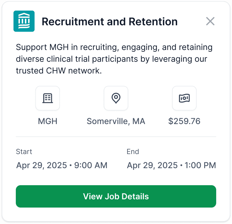
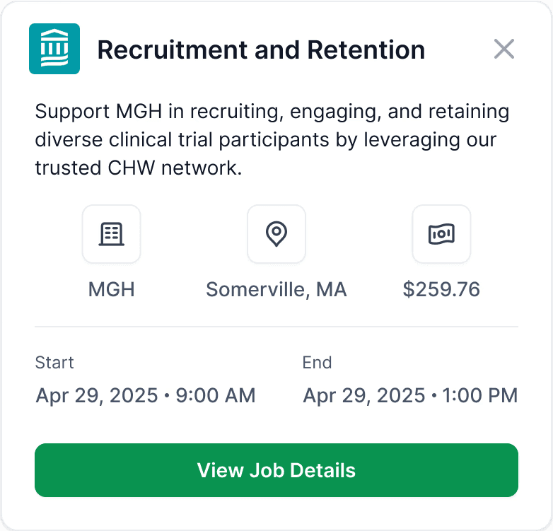
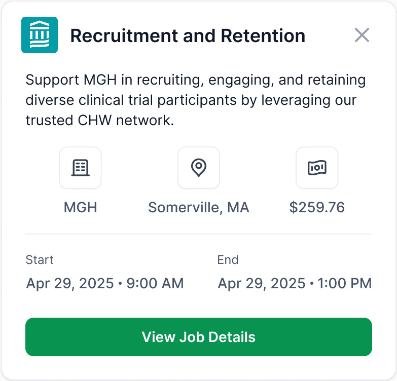
Though this was the final design handed off, I would have loved to integrate the map view into the normal dashboard, allowing users to toggle between views.
Though this was the final design handed off, I would have loved to integrate the map view into the normal dashboard, allowing users to toggle between views.
Reflections
Reflections
Reflections
Early communication when collaborating across teams
Early communication when collaborating across teams
Working within a small team, I learned the importance of having clear communication across disciplines, asking questions early to stay on the same page. In doing so, I was able to work efficiently to meet deadlines and handoff designs cleanly.
Working within a small team, I learned the importance of having clear communication across disciplines, asking questions early to stay on the same page. In doing so, I was able to work efficiently to meet deadlines and handoff designs cleanly.
Having ownership in my decisions
Having ownership in my decisions
Often, I found myself working from ambiguity, simply due to the nature of our fast-paced work. This taught me how to be confident in my decisions, leaning on my skills and experience as I worked through the each step of the design process. Being vocal in my perspective built trust with my team and allowed for open conversation to best address the problem.
Often, I found myself working from ambiguity, simply due to the nature of our fast-paced work. This taught me how to be confident in my decisions, leaning on my skills and experience as I worked through the each step of the design process. Being vocal in my perspective built trust with my team and allowed for open conversation to best address the problem.